Since Gutenberg’s release, I’ve found myself spending a bit of time enabling older sites to make use of the new Gutenberg features.
I decided it would be worth writing up this rough guide to getting a site “Gutenberg ready”, allowing it full use of the new Gutenberg editor.

Gutenberg Theme Support
You can add the following theme support inside functions.php. These will enable support for responsive-embeds and allow WordPress to load in the default Gutenberg block styles.
add_theme_support( 'responsive-embeds' );
add_theme_support( 'wp-block-styles' );
There’s a great Gutenberg specific theme support resource in the WordPress handbook, although it can be hard to find right now, since it doesn’t always return in google searches. You can read more about the above and anything else in this article over there.
Block Alignment
Theme Support
With Gutenberg, you can also choose to enable align-wide for your blocks. If you do, your theme will need to include styles for the two new block alignment classes .alignwide and .alignfull.
add_theme_support( 'align-wide' );Note: Rich Tabor’s Block Unit Test plugin is a great way to generate a page that includes most variations of the default blocks, which is handy for quickly testing.
Alignment with CSS
As mentioned above, your theme will now show the options for “wide” and “full” block-alignment, and add the corresponding classes. In order for them to appear correct visually, you will also need to add some css.
.alignwide,
.alignfull {
    margin-left: 0;
    margin-right: 0;
    position: relative;
    clear: both;
    left: -20px;
    width: calc(100% + 40px);
    max-width: calc(100% + 40px);
}
Note: the above scss is a starting point. Each theme will have different containers and gutters, some may even have containers within containers! When writing your styles, the aim is to bring the block outside of the main content container.
Align Wide
A block that’s aligned “wide” should appear wider than the rest of your content. I’ve found the best way to do this is to have the block width set to be 100% of the parent, than add pixels using the calc function. You can then shift the block to the left by using negative half of anything over 100%.
.alignwide {
    @media screen and (min-width: 570px) {
        left: -60px;
        width: calc(100% + 120px);
        max-width: calc(100% + 120px);
    }
}
You can also use additional percentages or different numbers at higher breakpoints to keep the block distinctly wider than the content.
Align Full
A “full” aligned block should always be fullwidth or reach the edge of the sites maximum width container. If the site has no max-width, align full should effectively always be 100% of the browser window width.
.alignfull {
    @media screen and (min-width: 570px) {
        left: calc(calc(-50vw + (570px / 2) - 20px));
        width: 100vw;
        max-width: 100vw;
    }
}
Above you can see the block is always 100vw. The left amount has been calculated by using negative half the screen width plus half the container and minus the gutter.
Custom Theme Colours and Font Sizes
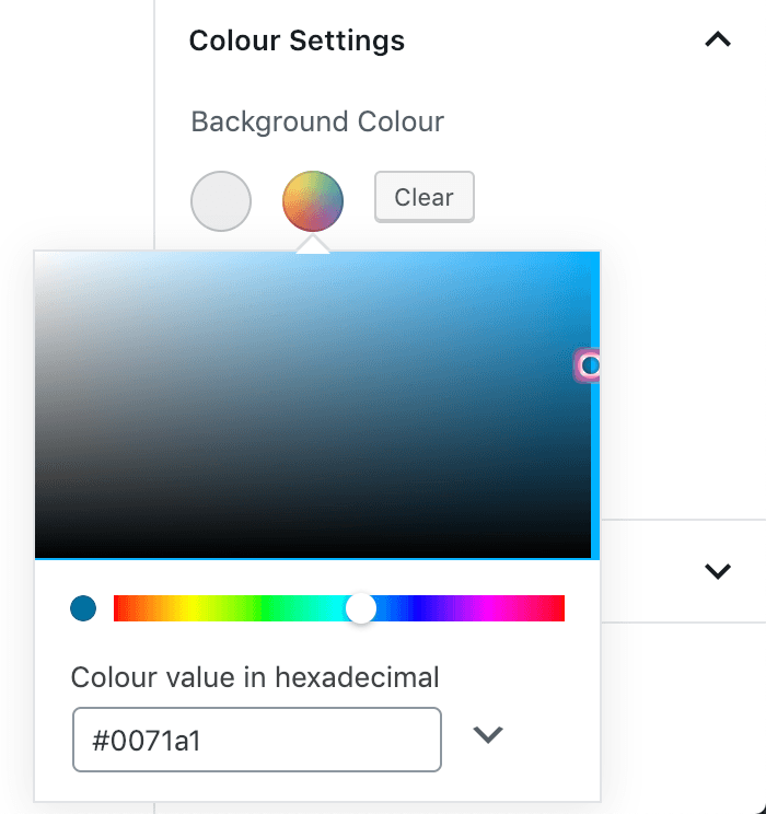
The default Gutenberg blocks come with colour palette and font size options. You can overwrite these with choices more suited to your theme by passing an array to the editor-color-palette and editor-font-sizes theme support functions.
add_theme_support(
    'editor-color-palette',
    array(
        array(
            'name'  => __( 'strong magenta', 'my-project' ),
            'slug'  => 'Offwhite',
            'color' => '#ededed',
        ),
    )
);

add_theme_support(
    'editor-font-sizes',
    array(
        array(
            'name' => __( 'Small', 'my-project' ),
            'size' => 12,
            'slug' => 'small',
        ),
    )
);
Disabling Options
Disabling Colours

If you want to remove these options entirely, you can pass an empty editor-color-palette, which will give no options. You can also disable the custom colour picker too, by passing disable-custom-colours.
add_theme_support( 'editor-color-palette' );
add_theme_support( 'disable-custom-colors' );
Disabling Fonts
You should also be able to disable the default font-size options, but there’s a bug in WP right now preventing the following from working.
add_theme_support( 'editor-font-sizes' );
add_theme_support( 'disable-custom-font-sizes' );
Judging by the discussion on github (issues/11628 and pull/13782), it’s expected to be resolved soon, and will work the same way the colours do.
Custom Editor Specific Styling
Adding editor styles has previously been possible by using the add_editor_style function, however with Gutenberg, you’ll also need to opt-in to using them by adding the editor-styles theme support.
add_editor_style( 'css/editor-style.css' );
add_theme_support( 'editor-styles' );


