Gutenberg is the codename for the new WordPress editor that was released in WordPress 5.0 back in December 2018. This is the second in our two-part series that will help you get started with the new ‘Block’ based editor when developing custom technical WordPress projects.

In our first post we covered how to get started with your development environment and built our first basic ‘static’ Block in WordPress. Next up we need to learn how to make the block dynamic and understand some of the fundamentals that make Gutenberg a little different from older WordPress development practices.
Our Static Block
Now we have our basic Block that was built in Part 1 you will also need to copy the code we have added so far into the save: property.
Before we move on however, let’s add some basic styles.
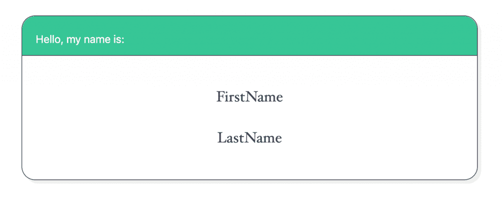
Isn’t she beautiful?
Making the block dynamic
Now to make it so that we can click into those name placeholders and change the text. To do this we are going to use a couple of RichText components.
We will first need to extract the RichText components from their namespace, so lets add this code to the top of our file:
/**
 * Load WordPress block libraries
 */
const { registerBlockType } = wp.blocks;
const { RichText }          = wp.editor;
Now in our edit function lets alter the HTML to use the RichText component.
...
<div class="name-badge__main">
	<RichText
		tagName="p"
		className={ 'name-badge__first-name' ) }
		placeholder={ __( 'Enter First Name', 'block-post' ) }
		onChange={ firstName => { setAttributes( { firstName } ) } }
		value={ firstName }
		keepPlaceholderOnFocus
	/>
	...
</div>
...
Here I have created the RichText component for the firstName attribute. The lastName will be pretty much the same, but with slight alterations to the class and variables.
As you can see, with JSX we have used the RichText component as HTML element, and the parameters it accepts we have passed as attributes on the element.
As per the readme for the component, there are other parameters available, but here is a quick overview of what we are using, and what it does:
-
tagName– This is the element that we want to render the control within. We are replacing a<p>element, so that is the element we are rendering out. className– The class name of the element we are rendering the control in the place of.placeholder– The placeholder for the field that we are rendering, to indicate that the text can be set.onChange– A function. Here we use the ‘special’setAttributevariable from the props, which is actually a function. By passing the variable of the changed value, we can update the attributefirstName.value– The attribute that sets the text in theRichTextcontrol.keepPlaceholderOnFocus– Indicates that we do not want the placeholder to hide as soon as focus is placed on the element.
Putting all that together, our block should start to look a little something like this:
The Save View
If we copied our static code from earlier into the save view, it should now be looking a little something like this:
...
save: props => {
	const {
		attributes: { firstName, lastName },
		className
	} = props;

	return (
		<section class={ [ 'name-badge', className ].join( ' ' ) } >
			<header class="name-badge__header">
				<h1 class="name-badge__title">Hello, my name is:</h1>
			</header>
			<div class="name-badge__main">
				<p class="name-badge__first-name">FirstName</p>
				<p class="name-badge__last-name">LastName</p>
			</div>
		</section>
	);
},
...
The only amendments we made from earlier is that we removed the setAttributes function from the props as we do not need it here.
All we need to do now is render the firstName and lastName attributes in this view. To do that, we just need to output them with JavaScript, like so:
...
save: props => {
	const {
		attributes: { firstName, lastName },
		className
	} = props;

	return (
		<section <section className={ [ 'name-badge', className ].join( ' ' ) } > } >
			<header class="name-badge__header">
				<h1 class="name-badge__title">Hello, my name is:</h1>
			</header>
			<div class="name-badge__main">
				<p class="name-badge__first-name">{ firstName }</p>
				<p class="name-badge__last-name">{ lastName }</p>
			</div>
		</section>
	);
},
...
Also notice that we have had to change the main class to use the className property. This is because React is unable to render the dynamic name on the save function without this function. Note also that we pass the other class names in as an array, and them join them together with a space className={ [ 'name-badge', className ].join( ' ' ) } which lets us output the dynamic class name and our own class name.
There are tidier, more advanced ways to do this, but we will save those for a future article.
The Final Product
Now, we can view our block on the front end, and it should look a little something like this:
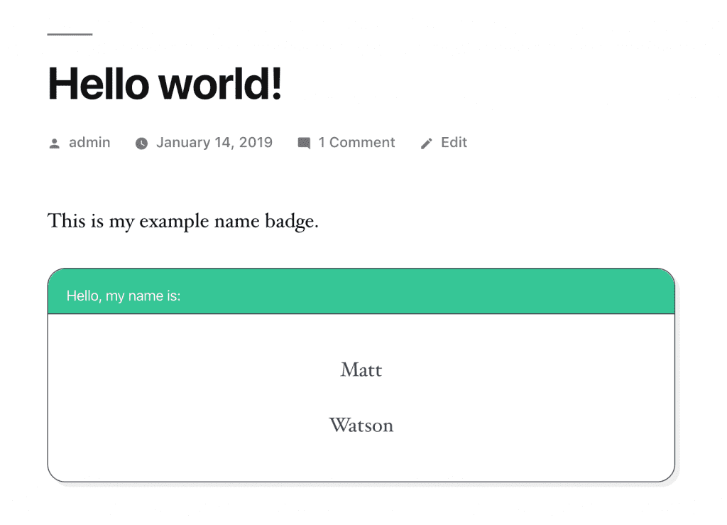
And that’s it! Your first ever (albeit very basic) WordPress Gutenberg Block!
What next?
We hope you find this Gutenberg WordPress development useful – you should also check out our ‘WordPress and Webpack‘ guide which will help to show how tools like Webpack and REACT are used by our specialist WordPress team when developing custom Gutenberg projects.
Need Help? We’re a Technical WordPress Development Agency
If you need WordPress project help or support designed to meet your organisations complex technical requirements then our WordPress agency can help!